UX Design
CircleUp
A redesign of an events platform focused on reducing drop-offs and improving attendance.
Year :
2025
Project Duration :
3 weeks

What was breaking
People don’t struggle to find events. They struggle to show up.
CircleUp is an existing platform where users RSVP with intent, but drop off before attending. Not because they’re uninterested, but because of hesitation, uncertainty, and lack of connection.
Events felt like a commitment made in isolation. With no context, no familiarity, and no real reason to follow through.
This redesign focused on that gap. Not discovery, but the drop between saying yes and actually going.

Designing for follow-through
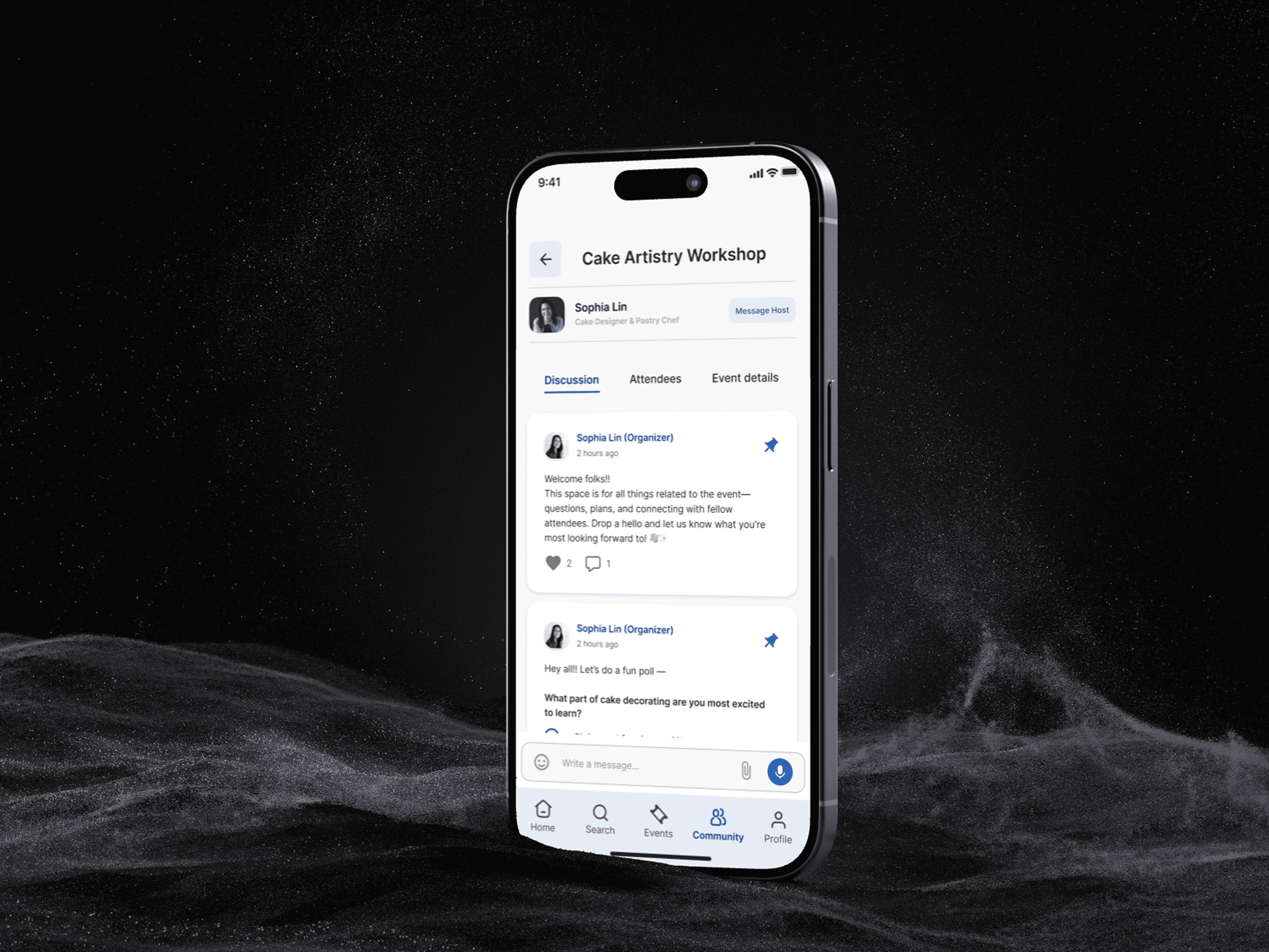
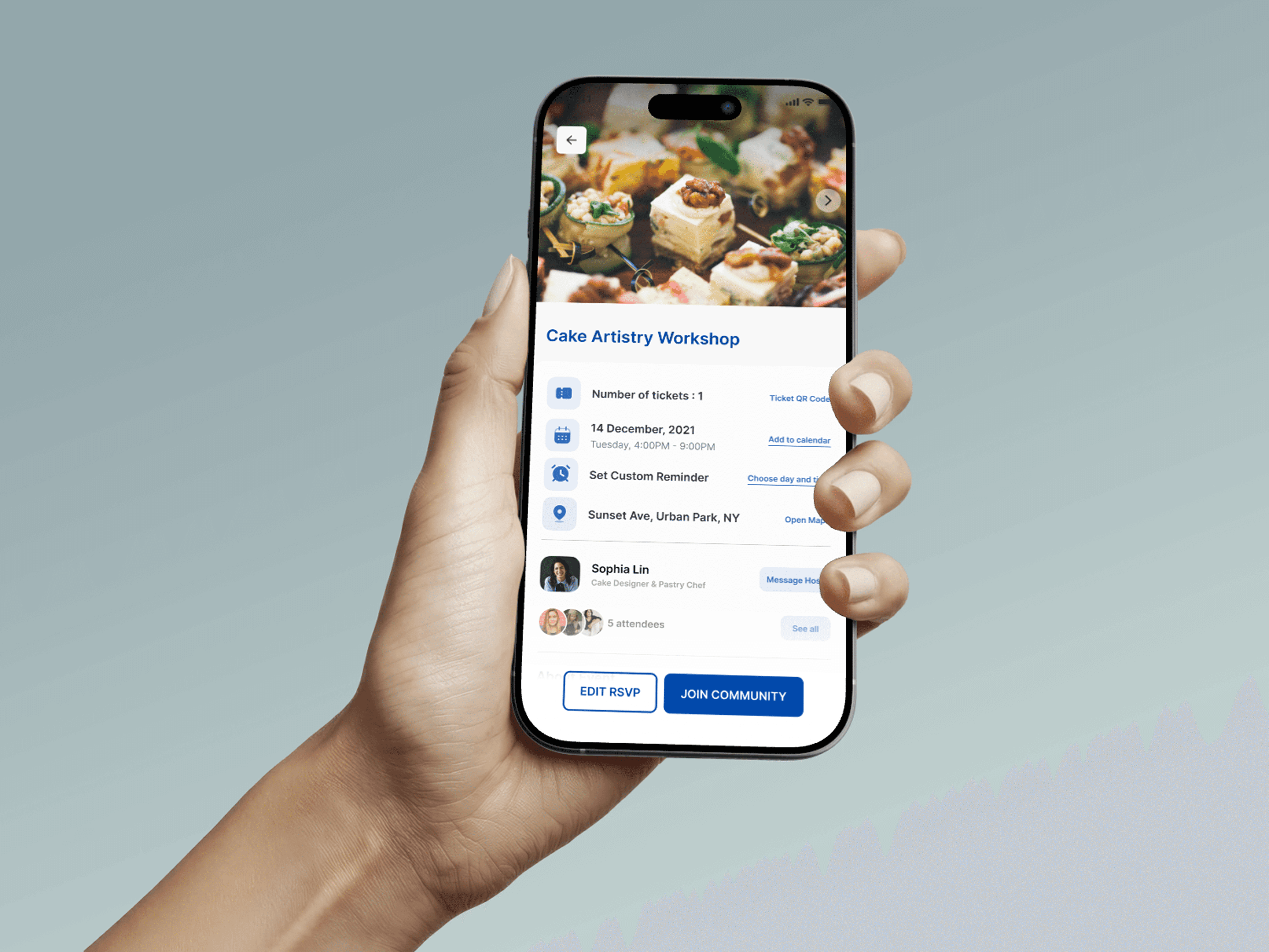
CircleUp was reworked to support users before the event, not just at it.
The focus shifted from event listing to pre-event experience:
spaces to interact with attendees before showing up
visibility into who’s going and what to expect
reminders that build mental commitment, not just notify
Each feature addresses a specific drop-off point in the existing flow.
The goal was simple. Make attending feel easier than backing out.
Key design decisions
This redesign focused on behavioral friction.
Too many reminders feel intrusive. Too little interaction leads to drop-offs.
Key decisions included:
replacing passive actions like “follow” with intentional message requests
introducing conversation prompts to reduce social friction
rethinking reminders to prepare users earlier, not just notify last minute
Every change was aimed at one outcome. Help users move from intent to action.
Shaped through real behavior
User research was used to uncover why users drop off in the existing experience.
Three consistent patterns emerged:
social anxiety before events
ineffective timing of reminders
lack of clarity about attendees and event atmosphere
These directly influenced attendance.
Testing focused on moments of hesitation. What users delayed, skipped, or ignored.
Designing for behavior, not just features
This was my first redesign, and it wasn’t clean. You inherit decisions, patterns, and behaviors that already exist.
I had to step into that mess and make sense of it. Figure out where things quietly break, where users hesitate, and where the system stops supporting them.
I worked through trade-offs. Simplifying interactions without removing context, and introducing new features without adding complexity.
This project taught me how to redesign without overdesigning. To work with what exists, and still move it forward.
More Projects


New release
Preview
UX Design
CircleUp
A redesign of an events platform focused on reducing drop-offs and improving attendance.
Year :
2025
Project Duration :
3 weeks
What was breaking
People don’t struggle to find events. They struggle to show up.
CircleUp is an existing platform where users RSVP with intent, but drop off before attending. Not because they’re uninterested, but because of hesitation, uncertainty, and lack of connection.
Events felt like a commitment made in isolation. With no context, no familiarity, and no real reason to follow through.
This redesign focused on that gap. Not discovery, but the drop between saying yes and actually going.
Designing for follow-through
CircleUp was reworked to support users before the event, not just at it.
The focus shifted from event listing to pre-event experience:
spaces to interact with attendees before showing up
visibility into who’s going and what to expect
reminders that build mental commitment, not just notify
Each feature addresses a specific drop-off point in the existing flow.
The goal was simple. Make attending feel easier than backing out.
Key design decisions
This redesign focused on behavioral friction.
Too many reminders feel intrusive. Too little interaction leads to drop-offs.
Key decisions included:
replacing passive actions like “follow” with intentional message requests
introducing conversation prompts to reduce social friction
rethinking reminders to prepare users earlier, not just notify last minute
Every change was aimed at one outcome. Help users move from intent to action.
Shaped through real behavior
User research was used to uncover why users drop off in the existing experience.
Three consistent patterns emerged:
social anxiety before events
ineffective timing of reminders
lack of clarity about attendees and event atmosphere
These directly influenced attendance.
Testing focused on moments of hesitation. What users delayed, skipped, or ignored.
Designing for behavior, not just features
This was my first redesign, and it wasn’t clean. You inherit decisions, patterns, and behaviors that already exist.
I had to step into that mess and make sense of it. Figure out where things quietly break, where users hesitate, and where the system stops supporting them.
I worked through trade-offs. Simplifying interactions without removing context, and introducing new features without adding complexity.
This project taught me how to redesign without overdesigning. To work with what exists, and still move it forward.
More Projects
New release
Preview